
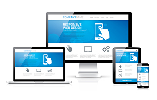
A mobile-responsive website is constructed so that content, images, and structure all display properly on a variety of devices. Originally, websites were designed for desktop computers, where visitors saw the full site. But now, if a visitor goes to a responsive site from a smartphone or tablet, the site retracts to fit a smaller screen. Note: A responsive web design works on both desktop and mobile devices. So the website displays seamlessly on both a mobile device and a desktop.
Why a Responsive Website is So Important
- Mobile usage is dramatically increasing. Next time you’re out on the street, notice how many people are obsessed with their cell phones. In 2014, mobile Internet usage is expected to overtake desktop usage.
- More than half of local searches are done on a mobile device. When consumers research a purchase, they use a mobile device more often than a desktop computer. Not only that: If your site isn’t mobile, you will also lose potential customers who search for local restaurants, theaters, and make spur-of-the-moment decisions about shopping, eating, and entertainment.
- More than 25 percent of Internet users in the U.S. have access only through a mobile device. If you don’t have a responsive website, you are overlooking a huge market and losing money every day you delay.
- Google prefers responsive design. It’s more efficient for their “bot” to crawl a responsive site than two separate websites.
- It’s easier for visitors to share, engage, and interact with the content on a responsive website. This makes people happy because the user experience is the same across multiple devices.
- Your website’s SEO ranking will be hurt. Not having a responsive site hurts your SEO ranking.
- Ignoring responsive design decreases sales conversions. Mobile users who can’t see your website properly will leave and never come back.
- Using mobile-responsive design allows you to segment your target audience using the advanced features in Google Analytics. You can understand more about how people are using your site, and discover which sales tactics and marketing strategies work.
- More than half of social media consumption happens on a mobile device. This is a really vital statistic, because what's the point of sharing content if your website isn’t displaying properly on a mobile device? You’ll only make visitors angry with you and leave.
A Better User Experience
As a business person, you understand the value of customer service. So if more and more prospective customers are using mobile devices to search and make purchases online, then you must deploy a mobile-friendly website. In fact, 85 percent of adults expect the mobile site to be just as good, if not better, than the desktop one!
Right now, chances are you have the advantage in adopting a responsive design because many of your competitors have been slow to realize they’re missing out on customers.
Stay ahead of your competition and get a site that stands out. Contact us today about making a big difference in sales.